Designing for Mobile Devices with Adobe Muse
Tips for designing for mobile:
- You are designing for a small screen, you need to clearly communication information
- Remember load speed—keep graphics to a minimum
- Less is more
- Single column layouts work best
- Think of content as collapsible
- Leave space between buttons
- User experience comes first, design comes second
Converting an existing desktop website to mobile version:
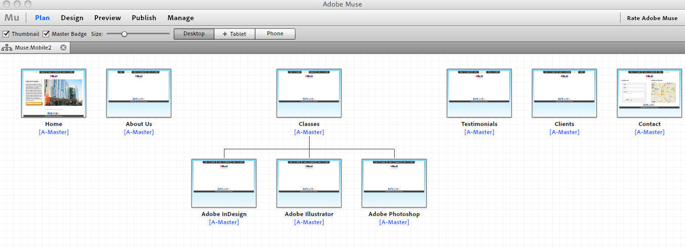
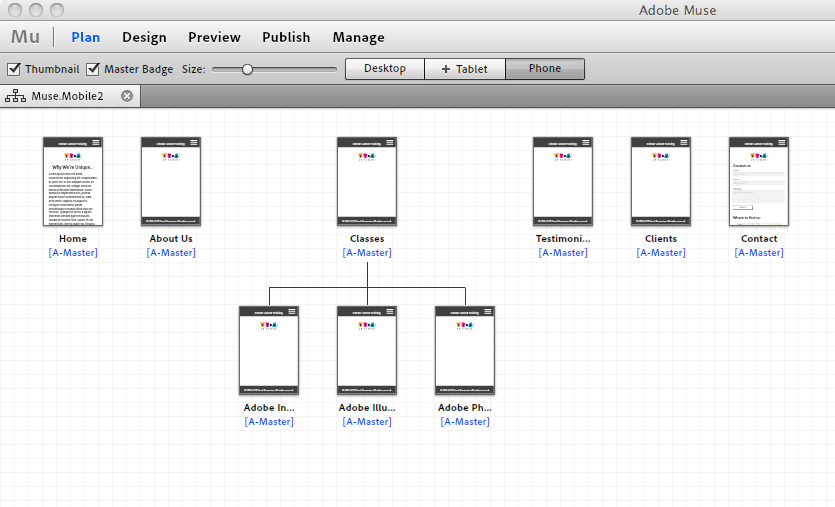
In the the example below, you see the desktop version of a website in Adobe Muse (in Plan view). To begin creating your mobile site, you simply click on the +Phone table and copy the site plan from your desktop site.
Moving Content from Desktop Site:
When transferring your content from the Desktop version to the Mobile version, keep the above tips in mind—what content do you need, what can you eliminate from the mobile version? Typically you will have to enlarge the type size on your mobile version. Use Master Pages to make save time and make your life easier.
Publishing and Testing your Mobile Site:
Publishing a mobile site in Muse is the same as publishing a desktop site. Muse puts a small snippet of code into site and will recognize the device user is on. There are several ways to test your mobile site—one easy way to do that is to use the “Preview” option inside Muse. The Preview option lets you see what your mobile site would look like on iPhone 4, iPhone 5, Samsung Galaxy S III, and Nokia Lumina 920. There are several options on the web, including an iOS simulator, that let you preview what your mobile site will look like. It’s important to test on as many phones as possible.
To get a free 30 day trial of Muse CC:
- Go to: https://creative.adobe.com/products/muse
- Click “Download Trial”


